Uvanlig Display-annonse ga svimlende tall
Designbyrået Page Black hadde et mål om å øke markedsdekning, og søkte vår hjelp for å styrke synligheten. Gjennom en grundig tilpasset annonsestrategi oppnådde de imponerende resultater, med 500.000 visninger fordelt på 43.000 klikk!
Utfordringen
Page Black Design er et designbyrå som leverer alt innen grafisk design, visuelle identiteter, re-branding, webdesign samt strategi- idé- og konseptutvikling for en rekke kjente merkevarer i Norge. Designbyrået har jobbet med imponerende prosjekter som blant annet X-Games, Findings, laget logo for en by(!) og laget design for mange av Norges fremste kunstnere og arkitekter.
Page Black Design kom til oss for bistand med annonsering. Til tross for store kundeoppdrag opplevde de selv at rekkevidden ikke var tilstrekkelig nok, og ønsket derfor å få navnet sitt mer kjent der ute. I samråd med Solid Media ble hovedfokuset med prosjektet å sørge for at folk får vite hvem de er - og allerede der begynte ballen å rulle.
Resultater
Dette har virkelig fungert, for nå har vi hvert fall fullt opp frem til våren og kan med det understreke viktigheten av å bruke dyktige folk i en AI-tid, selv med en slunken lommebok. Page Black selger jo ikke spader, så vi hadde lave forventninger med tanke på henvendelser. Det aller viktigste var å få vårt navn på blokka - noe vi har klart!
Vegar Bakken
Gründer, Page Black Design
Løsningen
Page Black har en iboende styrke ved godt design, og generisk reklame var det stikk motsatte av det de var ute etter. Målgruppen selv er bevisst på godt design, og ved å ha et passende uttrykk appellerte vi bedre til målgruppen.
Vi startet med å kartlegge porteføljen deres - hva slags prosjekter har Black Design jobbet med tidligere? Hvilket typisk designuttrykk er det de går for? I tillegg var det avgjørende å holde en god dialog, der vi fikk vite hva som er viktig for byrået og hvordan de ønsker å posisjonere seg i markedet. Alt dette i kombinasjon med hva slags kunder de faktisk ønsker seg, fortalte oss mye om deres identitet, hvem de er og hvor de vil.
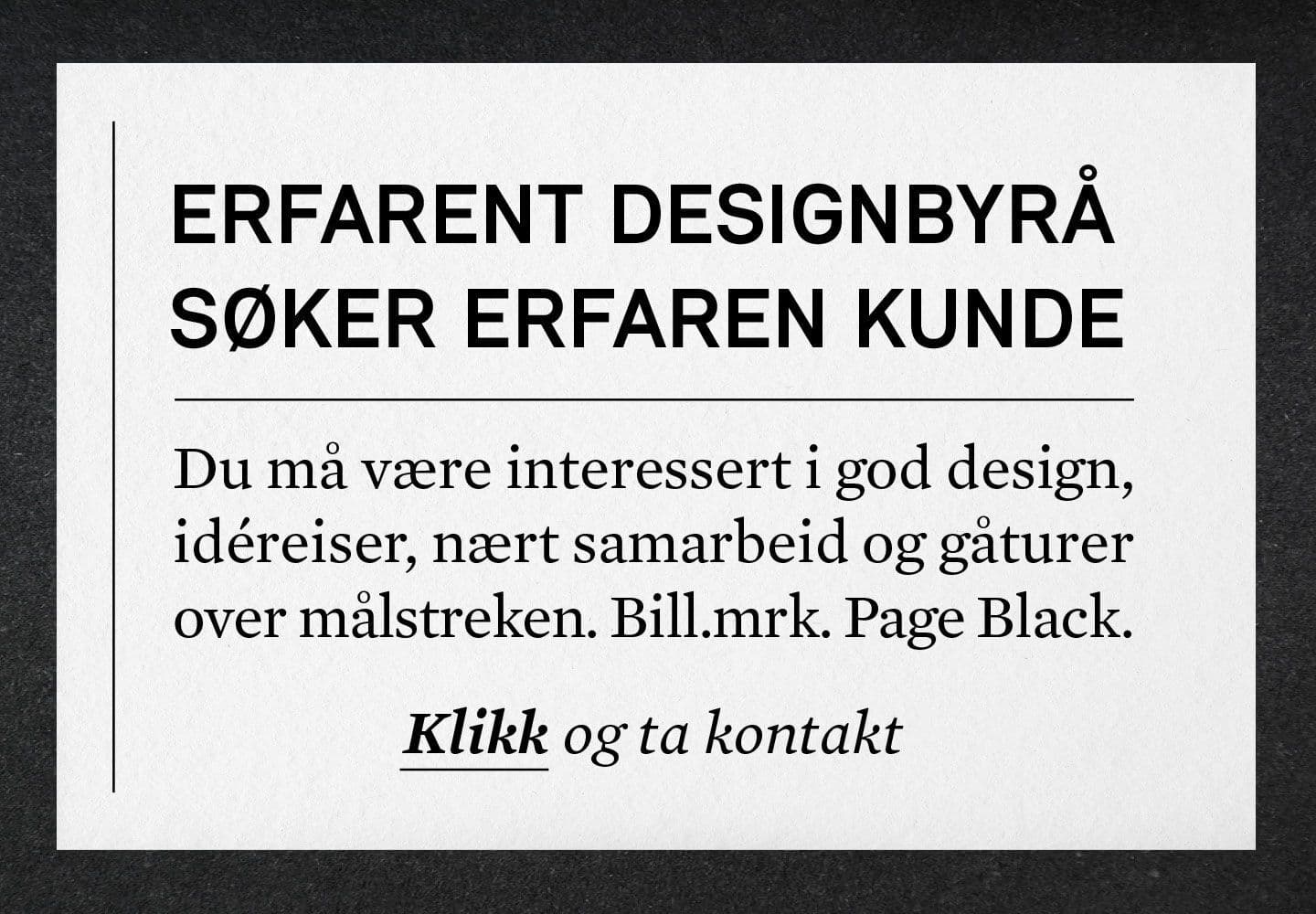
Det neste steget var å finne et treffende budskap i annonsen. For å nå målet med større dekning og kjennskap til den utvalgte gruppen, måtte budskapet passe som hånd i hanske og være i tråd med hvem de er. Som en sparringspartner for Black Design, satte vi av god tid til budskapet alene. Resultatet ble Display-annonser der budskapet i seg selv fikk skinne, uten noe ekstra støy eller “reklamete” vibber.
Budskapet ble: Erfarent designbyrå søker erfaren kunde.
Med tanke på at en typisk erfaren kunde ofte gjelder alderen 40+ og daglige ledere, lot vi oss inspirere av de eldre avisannonsene. Det var helt åpenbart at en kontaktannonse - med et design og skrifttype som var tilsvarende - kunne vekke et nostalgisk minne hos nettopp de vi var ute etter. Ved å skjule logoen og utelukke alt av CTA-knapper, utarbeidet Page Black eget innhold med det uttrykket vi så for oss - nemlig cleant, annerledes og organisk. Dette “stuntet”, som var Page Black sin egen idé, ga folk muligheten til å bli mer kjent med personligheten til designbyrået, der kjemi og humor er to viktige elementer av et samarbeid hos dem.
Dette samarbeidet har virkelig bevist at to byråer med hver sine styrker og kompetanse, kan være en oppskrift til suksess. Takket være en åpen dialog og tett samarbeid endte vi opp med en god kunderelasjon og hårreisende resultater!
Kamilla Krane
Kommersiell Leder
Er du vår neste suksesshistorie?
Ta kontakt for en uforpliktende prat om hvordan vi kan hjelpe din bedrift.